Allow SwiftUI to display Indicator during communication
I want to display the Loading screen with SwiftUI!
先に現在できているコードを記載します。 また今回のコードのIndicator部分については、tsuzuki817さんの作りながら学ぶ! SwiftUIアニメーション インジケーター編を参考にさせていただきました。なのでIndicatorの実装に関する詳細は省略します。
Here is the code that is currently available. Also, learn about the Indicator part of this code of ‘作りながら学ぶ! SwiftUIアニメーション インジケーター編‘ written by tsuzuki817!. So I will omit the details about the implementation of Indicator.
struct LoadingIndicatorView: View {
    let isLoading: Bool
    @State private var isAnimating = false
    private let animation = Animation.linear(duration: 1).repeatForever(autoreverses: false)

    var body: some View {
        GeometryReader { geometry in
            ZStack {
                // ①Nearly transparent layer to prevent tapping the screen during loading
                Color(.black)
                    .opacity(0.01)
                    .frame(width: geometry.size.width, height: geometry.size.height)
                    .edgesIgnoringSafeArea(.all)
                    .disabled(self.isLoading)
                Circle()
                    .trim(from: 0, to: 0.6)
                    .stroke(AngularGradient(gradient: Gradient(colors: [.gray, .white]), center: .center),
                            style: StrokeStyle(
                                lineWidth: 8,
                                lineCap: .round,
                                dash: [0.1, 16],
                                dashPhase: 8))
                    .frame(width: 48, height: 48)
                    .rotationEffect(.degrees(self.isAnimating ? 360 : 0))
                    // ②Implementation of animation
                    .onAppear() {
                        withAnimation(Animation.linear(duration: 1).repeatForever(autoreverses: false)) {
                            self.isAnimating = true
                        }
                    }
                    .onDisappear() {
                        self.isAnimating = false
                    }
            }
             // ③Make the Loading screen displayed only during Loading.
            .hidden(!self.isLoading)
        }
    }
}
When using it, write as follows. This will show / hide is Loading.
@State private var isLoading = false
var body: some View {
ZStack {
Text("Hello world!")
LoadingIndicatorView(isLoading: self.isLoading)
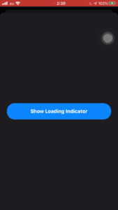
}
}In the following Gif screen, if you tap the blue button in the middle, isLoading will be true for 3 seconds, so the Loading screen will appear for 3 seconds.
Also, the blue button cannot be tapped while the Loading screen is displayed.
Implementation details
① Almost transparent layer to prevent tapping the screen during loading
Color(.black)
    .opacity(0.01)
    .frame(width: geometry.size.width, height: geometry.size.height)
    .edgesIgnoringSafeArea(.all)
    .disabled(self.isLoading)
The reason why it is “almost” transparent is that if you say that it is set to Color(.clear), even if you specify disabled, the gesture to the screen will work.
It took me quite a while to notice this. I couldn’t think of a beautiful way to write it, so I created a black layer for the time being and set .opacity(0.01) to it, and managed to create a layer that was infinitely transparent and disabled the user’s gestures. .. Isn’t this a bug in SwiftUI?
By the way, if you specify a color other than .clear, disabled will work properly.
② Animation implementation
In the reference material, it was written as follows, but with this, the injector will rotate clockwise and counterclockwise alternately each time the Loading animation is executed. ..
.onAppear() {
    withAnimation(
        Animation
            .linear(duration: 1)) {
                self.isAnimation.toggle()
    }
Therefore, I changed the implementation to set isAnimation to true in onAppear() where View is displayed and false in onDisappear() which is hidden. Now, no matter how many times the Loading screen is displayed, the Indicator will rotate clockwise all the time.
.onAppear() {
    withAnimation(self.animation) {
        self.isAnimating = true
    }
}
.onDisappear() {
    self.isAnimating = false
}
③ Make the Loading screen displayed only during Loading. Implement so that the loading screen is displayed / hidden according to the isLoading flag of the parent View. The relevant part is the following line.
.hidden(!self.isLoading)hidden is a custom modifier. The detailed implementation is summarized here.
The problem is that if the value of isLoading is passed to hidden as it is, the Loading screen will be hidden when isLoading is true, so as! Self.isLoading, the value of Boolean is replaced and passed to hidden.
Summary
SwiftUIは1つのファイルにまとめすぎると、かなり読みづらくなる印象があるので、カスタムのViewやModifier、extensionなどを作成して、コードを分割することで、可読性がかなり上がるなと思いました。
まだまだSwiftUIはUIKitと比較するとできることは限られていますが、これからはきっとSwiftUIが主流になっていくと思うので、SwiftUIのキャッチアップも進めていきたいですね。
I have the impression that SwiftUI becomes quite difficult to read if it is put together in one file too much, so I thought that readingability would be considerably improved by creating custom views, modifiers, extensions, etc. and dividing the code.
There is still a limit to what SwiftUI can do compared to UIKit, but I think SwiftUI will become mainstream in the future, so I would like to continue catching up on SwiftUI.

